
The Psychology of Color in Home Decoration: Crafting Spaces That Nurture, Inspire, and Reflect You
Keywords: Color psychology decor, emotional decor, home mood colors
TL;DR:
- Color psychology in home decor goes beyond aesthetics—it directly impacts mood, behavior, and wellbeing
- Blues and greens promote calm and focus, warm colors like yellow and orange create energy and sociability
- Neutrals provide balance and foundation for more expressive accent colors
- The perfect color scheme considers room function, lighting conditions, personal preferences, and cultural associations
- Rather than following rigid rules, use color psychology as a framework, then trust your intuitive response
- Create spaces that authentically support your lifestyle and emotional needs through intentional color choices
Introduction: More Than Just Paint on the Walls
Step into any room, and before you consciously register the furniture arrangement or the specific objects within it, you feel something. That initial, often subconscious, response is frequently driven by the most pervasive element of design: color. Our homes are our sanctuaries, our workspaces, our social hubs – environments where we spend a significant portion of our lives.
It stands to reason that the colors enveloping us within these spaces have a profound impact, influencing our moods, shaping our perceptions, and even subtly guiding our behaviors Foyr Neo.
I’ve always been fascinated by how a space can transform with nothing more than a new paint color. One thing I’ve noticed after years of exploring interior design is that many people underestimate just how dramatically color can affect their experience of a space. Beyond mere aesthetics, color creates feeling.
Furthermore, what resonates with me is watching how people’s energy shifts when they walk into a room that’s been thoughtfully colored to support its purpose.
While the idea that color affects mood might seem intuitive, applying it effectively in home decoration requires moving beyond simple associations. It involves understanding the nuances of different hues, the impact of light and context, and crucially, acknowledging the highly personal nature of color perception Color Psychology: How to Design a Home That Feels Right.
As a result, truly masterful color application becomes less about following prescribed rules and more about developing a sensitivity to how colors interact with spaces and people.
This article delves into the fascinating world of color psychology decor, exploring how you can harness the power of home mood colors to create truly emotional decor – spaces that not only look beautiful but actively support your well-being, enhance functionality, and authentically reflect who you are.
What Exactly is Color Psychology (and What It Isn’t)?
Color psychology is the study of how different hues influence human behavior, mood, emotions, and even physiological responses Verywell Mind. In interior design, it’s the practice of using color strategically to create specific atmospheres and evoke desired feelings within a space Interior Design Institute. For instance, surrounding someone with calming blues might lower their heart rate Foyr Neo, while vibrant reds could increase energy levels.
However, it’s crucial to approach color psychology with nuance. While research and long-standing associations provide valuable guidelines, it’s not an exact science with universally guaranteed outcomes UX Collective. Several factors complicate a simple “color = emotion” equation:

Subjectivity and Personal Experience
Our individual histories, memories, and preferences deeply influence how we react to colors Foyr Neo. A color associated with a happy childhood memory for one person might evoke a negative feeling for another. In addition, these personal associations often operate below conscious awareness until we specifically reflect on them.
I think one of the most revealing moments in my interior design journey was when a friend couldn’t understand why the “calming” blue bedroom I suggested made her feel anxious. It wasn’t until we explored her experiences that she recalled her childhood bedroom – where she experienced frequent nightmares – was painted a similar shade. We switched to a warm terracotta, and she reported much better sleep within weeks.
Cultural Context
Color symbolism varies significantly across cultures wllw.eco. White signifies purity and weddings in many Western cultures, but it’s associated with mourning in some Eastern cultures. Red might mean danger or passion in one context, and good fortune in another.
Context within the Space
The same color can feel different depending on the room’s function, lighting, size, and the other colors it’s paired with Color Psychology: How to Design a Home That Feels Right. A bright yellow might be cheerful in a kitchen but anxiety-inducing in a bedroom Why Skylights.
Shade, Tint, and Tone
The intensity (saturation) and lightness/darkness (value or tone) of a color dramatically alter its psychological impact OLT DESIGN. A soft, pale blue is calming, while a deep, electric blue can be stimulating or even feel cold.
Therefore, while we can discuss general tendencies and common associations backed by observation and some scientific study, color psychology in home decor is best used as a powerful guide, not a rigid set of rules Foyr Neo. It provides a framework for intentional design, encouraging a deeper consideration of how our spaces feel, rather than just how they look. It’s about leveraging common responses while always filtering them through the lens of personal needs and preferences Moretti Interior Design.
The Emotional Spectrum: Decoding the Impact of Individual Colors
Let’s explore the commonly observed psychological effects of various colors in the context of home decoration:
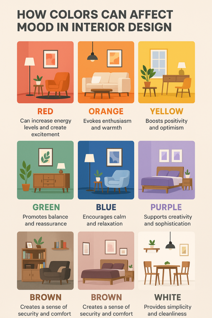
Warm Colors: Energy, Excitement, and Comfort
Warm colors (reds, oranges, yellows) are generally associated with energy, stimulation, and warmth Home Design Institute. They tend to advance visually, making spaces feel cozier or potentially smaller.
Red:
Psychological Effects: Passion, energy, excitement, strength, appetite stimulation, urgency, love Verywell Mind. Can also signify danger or aggression if overused. Physiologically, it can increase heart rate and blood pressure Why Skylights.
Decor Use: Ideal for stimulating conversation and energy in dining rooms or living rooms. Effective as an accent color (e.g., cushions, artwork, a feature wall) to add vibrancy without overwhelming. Can appear rich and elegant in low light, making muted reds suitable for intimate spaces used after dark. Use cautiously in bedrooms or areas meant for relaxation.
Unique Insight: I’ve found that while red is often warned against in large doses, a deep, muted red (like burgundy or terracotta) can create a surprisingly cozy and sophisticated atmosphere, especially when balanced with neutrals. One dining room I designed with burgundy walls initially seemed daring but created a wonderful ambiance of warmth and intimacy that made dinner parties feel special.
Orange:
Psychological Effects: Enthusiasm, warmth, creativity, friendliness, energy, excitement Foyr Neo. Less intense than red but still highly stimulating.
Decor Use: Great for social areas like living rooms, kitchens (can stimulate appetite) Robern, and playrooms. Also effective in home gyms to boost energy. Muted oranges (like terracotta or peach) offer warmth without being overwhelming. Use brighter oranges more sparingly or as accents.
Unique Insight: I think orange is one of the most underrated colors in home design. It can be perceived as more welcoming and less aggressive than red, making it a good choice for entryways where you want to create an immediate sense of warmth and hospitality. I love how a soft terracotta entry hall can make visitors consistently comment on how “immediately comfortable” they feel upon entering.
Yellow:
Psychological Effects: Happiness, optimism, joy, intellect, energy, attention-grabbing Home Design Institute. Associated with sunshine and cheerfulness. Can stimulate mental activity.
Decor Use: Excellent for kitchens, breakfast nooks, bathrooms, and hallways to bring in light and positivity. Soft, buttery yellows are generally welcoming. Intense yellows can cause anxiety or irritation, and studies suggest babies may cry more in bright yellow rooms In Honor Of Design. Best used thoughtfully, perhaps balanced with cooler tones or neutrals, or as uplifting accents.
Unique Insight: The type of yellow matters immensely. A pale, creamy yellow can act almost as a neutral, providing warmth without intensity, while a vibrant lemon yellow demands attention and should be used strategically. One thing I’ve noticed is that north-facing rooms that receive little natural light can be transformed with the right shade of yellow, creating an artificial “sunlight” effect that brightens even the darkest spaces.
Cool Colors: Calm, Serenity, and Focus
Cool colors (blues, greens, purples) generally evoke feelings of calm, relaxation, and spaciousness. They tend to recede visually, making rooms feel larger.
Blue:
Psychological Effects: Calm, stability, serenity, productivity, focus, trustworthiness, loyalty Verywell Mind. Associated with sky and water, often perceived as peaceful. Can lower blood pressure and heart rate. Some darker or grayer blues can feel cold or sad.
Decor Use: Highly versatile. Ideal for bedrooms (promotes rest), bathrooms (spa-like feel), and home offices (aids concentration). Lighter blues create an airy feel, while deeper blues (like navy) add sophistication and can feel cocooning. Balance deep blues with warm elements (wood, brass) to avoid coldness. Often cited as a globally favorite color.
Unique Insight: Blue is often considered universally positive, but its perceived temperature is key. In rooms with little natural light, a cool blue can feel unwelcoming. I’ve found that blues with warmer undertones (like teal) work best in these spaces, or pair cool blues with warm lighting and natural textures. My favorite approach for north-facing bedrooms is using a blue with subtle green undertones (a soft teal) to prevent that chilly feeling while maintaining the calming effect.
Green:
Psychological Effects: Nature, tranquility, health, growth, harmony, balance, safety, restoration Verywell Mind. Restful for the eyes. Reduces stress and promotes calm. Can enhance creativity. Some deep greens can be associated with envy, while olive green signifies peace.
Decor Use: Extremely versatile, suitable for almost any room. Excellent for bedrooms, living rooms, bathrooms, and offices. Light greens (sage, mint) are calming and refreshing. Deeper greens (emerald, forest) add richness and a connection to nature. Pairs well with natural wood tones.
Unique Insight: I think incorporating actual plants alongside green paint enhances the biophilic connection, amplifying the calming and restorative effects. In my experience, green is one of the most “livable” colors over time – while trends in blues, grays, and other colors come and go, the right green rarely feels dated or tiresome because of our innate connection to nature.
Purple:
Psychological Effects: Royalty, luxury, creativity, spirituality, mystery, wisdom Foyr Neo. Lighter shades (lavender, lilac) are restful and calming, similar to blue but with added warmth. Deeper shades (eggplant, plum) feel dramatic and sophisticated.
Decor Use: Good for bedrooms (especially lighter shades for calm), creative spaces, and adding accents of luxury in living rooms or dining rooms. Deep purples work well in intimate spaces like reading nooks. Can sometimes feel artificial or overly moody if not balanced.
Unique Insight: Purple strikes a balance between the stimulation of red and the calm of blue Home Design Institute. This makes it uniquely suited for spaces where both creativity and relaxation are desired, like a personal study or a luxurious bathroom. I’ve noticed that purple rooms with lots of texture seem to come alive in a way that flat applications don’t – the interplay of light creates depth that other colors don’t always achieve.
Neutrals: Balance, Foundation, and Sophistication
Neutrals provide a backdrop, create balance, and allow other colors to shine. They are foundational in many design schemes.
White:
Psychological Effects: Purity, cleanliness, spaciousness, simplicity, innocence, peace, relief Verywell Mind. Can make rooms feel larger and brighter by reflecting light.
Decor Use: Excellent base color for walls and ceilings. Works well in minimalist, Scandinavian, and modern designs. Can be used anywhere, especially small spaces. Can feel sterile or cold if not warmed up with textures, wood tones, or accent colors. Shows dirt easily.
Unique Insight: The “temperature” of white is critical. Cool whites have blue/grey undertones and feel crisp, while warm whites have yellow/pink undertones and feel cozier. Choosing the right white depends on the room’s light and desired mood House Beautiful. I’ve discovered that using multiple “whites” throughout a home – each calibrated to specific light conditions – creates a sophisticated flow that uniform white never achieves.
Black:
Psychological Effects: Sophistication, power, elegance, drama, mystery, formality Swatchbox. Can also feel heavy, oppressive, or sad if overused.
Decor Use: Primarily used for accents – furniture legs, window frames, picture frames, hardware – to ground a space and add contrast. Can be used on a feature wall for drama in the right context (e.g., a media room). Combining with white creates a classic, high-contrast look. Needs ample light to avoid feeling gloomy.
Unique Insight: I think texture plays a huge role in how black is perceived. Matte black offers a modern, understated sophistication, while glossy black feels more glamorous and reflective. One of my favorite design surprises was a home theater with matte black walls that created an infinite space effect, enhancing the immersive viewing experience by making the boundaries of the room visually disappear.
Gray:
Psychological Effects: Neutrality, balance, sophistication, practicality, timelessness Foyr Neo. Can also feel drab, unemotional, or depressing if not used carefully or if the wrong tone is chosen.
Decor Use: Highly versatile base color, popular in modern and contemporary design. Works well in living rooms, offices, and bedrooms. Comes in warm (greige) and cool tones. Pair with accent colors to add personality.
Unique Insight: Gray’s neutrality makes it highly susceptible to the influence of surrounding colors and light. A gray room can feel completely different depending on whether it’s paired with warm woods and yellow accents versus cool blues and chrome. In regions with prolonged overcast weather, I’ve found that warmer grays with taupe or beige undertones work better than cooler blue-grays, as they help counteract the psychological effects of limited sunlight.
Brown:
Psychological Effects: Earthiness, stability, comfort, warmth, security, reliability Verywell Mind. Associated with wood and nature.
Decor Use: Common in furniture, flooring, and natural elements (wood beams, leather). Creates a cozy, grounded feeling. Works well in living rooms, studies, and rustic or traditional styles. Can feel heavy or dull if not balanced with lighter colors or textures.
Unique Insight: I love how layering different shades and textures of brown (e.g., dark wood floor, lighter wood furniture, beige walls, tan leather) creates depth and richness, preventing the color from feeling monotonous. One of my favorite spaces uses five different brown tones from chocolate to cream, creating a cocoon-like environment that feels simultaneously grounding and uplifting – proving that “boring” brown can create extraordinary emotional impact when used with intention.
Pink:
Psychological Effects: Calmness (especially softer shades), romance, playfulness, sweetness, nurturing, compassion, love Verywell Mind. Some studies suggest certain shades (like Baker-Miller pink) have a temporary calming effect. Vibrant pinks (hot pink) share the energetic qualities of red.
Decor Use: Often used in bedrooms (especially children’s) and nurseries. Soft blush pinks are increasingly used as sophisticated neutrals in living rooms and bathrooms. Can be balanced with grays, greens, or metallics to avoid feeling overly sweet or juvenile.
Unique Insight: Pink’s association is shifting. Once primarily seen as feminine, muted and dusty pinks are now recognized as versatile hues that can add warmth and personality without overwhelming a space, working well in gender-neutral designs Martha Stewart. The key is finding the right undertone – pinks with gray undertones feel sophisticated and modern, while those with peach undertones feel warmer and more energetic. I think a soft blush in living rooms creates a subtle glow effect that’s particularly beautiful at sunset, demonstrating how pink can create magical light effects unlike any other color.
Table: Summary of Color Psychology in Decor and Interior Design
Applying Color Psychology Room by Room: Tailoring Mood to Function
The ideal color palette for a room depends heavily on its primary function and the desired mood The Psychology of Color: How Colors Affect Our Mood and Behavior.
Living Room: Goal: Social Interaction, Relaxation, Comfort
Colors: Warm neutrals (beige, greige, warm gray) create a welcoming base OLT DESIGN. Blues and greens promote relaxation Why Skylights. Yellow or orange accents can stimulate conversation and add energy. Consider the balance – a primarily relaxing space might use cool tones with warm accents, while a more energetic social hub might reverse this.
Case Study: I once helped a family that entertained frequently but also valued quiet evenings at home design a living room with walls in a warm greige that could adapt to both scenarios. For entertaining, we added orange and yellow throw pillows and art that energized the space. For quiet evenings, these could be swapped for blue and green accessories, demonstrating how the same base color can support different moods through simple accent changes.
Bedroom: Goal: Rest, Relaxation, Intimacy

Colors: Cool colors like soft blues, greens, and lavenders are highly recommended for their calming effects House Beautiful. Muted pinks can also be soothing. Deep, cocooning colors like navy or charcoal can work if balanced, creating intimacy. Avoid highly saturated, energetic colors like bright red or yellow as dominant hues.
Case Study: I think one of the most dramatic transformations I’ve seen was when a friend with insomnia switched to a soft sage green color scheme, with slightly darker walls behind the headboard to create a cocooning effect. Three months later, she reported her sleep had improved significantly. This wasn’t just decoration – it was creating a therapeutic environment that addressed a specific need.
Kitchen: Goal: Energy, Appetite, Cleanliness, Social Hub
Colors: Yellows and oranges can stimulate appetite and create a cheerful atmosphere Robern. Red accents can add energy. White and light blues/greens promote a sense of cleanliness. Consider the kitchen’s role – is it purely functional or a gathering space? Adjust energy levels accordingly.
Before & After Example: A dark, dated kitchen I helped design had brown cabinets and felt cramped and uninviting. We painted the cabinets a soft cream, the walls a warm butter yellow, and added terracotta tile accents. The result was transformative – visually larger, mood-lifting, and suddenly the heart of the home where people naturally gathered.
Bathroom: Goal: Cleanliness, Relaxation, Spa-like Serenity
Colors: Blues, greens, and whites are classic choices, evoking water, nature, and purity Color psychology in interiors: How to choose colors that enhance mood. Spa-like neutrals (soft grays, beiges) combined with natural textures work well. Brighter colors like yellow or coral can be used in powder rooms for a touch of unexpected energy.
Unique Application: For a friend with a stressful job who valued his morning shower as “meditation time,” we created a bathroom with a gradated blue wall that transitioned from deep navy at the bottom to sky blue at the top, mimicking the horizon. He called it his “5-minute vacation” – a perfect example of color psychology creating genuine emotional value in daily life.
Home Office: Goal: Productivity, Focus, Creativity
Colors: Blue is known to enhance focus and productivity The Psychology of Color: How Colors Affect Our Mood and Behavior. Green can reduce eye strain and boost creativity Nippon Paint Singapore. Avoid distracting bright reds. Yellow accents might stimulate mental activity. Choose based on the type of work – analytical tasks might benefit more from blue, creative tasks from green.

Personal Experience: One thing I’ve noticed with home offices is that the color needs to match the type of work being done. A writer friend transformed her office from white to sage green and saw measurable improvements – less eye strain during long computer sessions, increased creativity, and better focus for longer periods. I loved how she also reported that the room felt less cold in winter and less hot in summer, though the actual temperature hadn’t changed!
Kids’ Rooms: Goal: Playfulness, Creativity, Rest
Colors: Brighter colors can stimulate play and learning (yellows, oranges, blues, greens) In Honor Of Design. Balance is key – perhaps designate a calmer color zone for sleep (soft blue/green) and brighter colors for play areas. Avoid overly stimulating colors (like bright red) in sleep areas. Consider the child’s preferences and age.
Growth Approach: I think one of the smartest approaches for children’s rooms is creating a design that won’t need repainting as they grow. For a toddler’s room, consider choosing a calming pale teal for the sleep area, vibrant but not overwhelming orange and yellow accents in the play zone, and incorporating easily changeable elements like artwork and textiles that can mature with them. This approach honors both color psychology principles and practical considerations of designing for a growing child.
Dining Room: Goal: Appetite Stimulation, Conversation, Ambiance
Colors: Red is traditionally linked to stimulating appetite and conversation Why Skylights. Oranges and warm yellows also work well. Deeper, richer colors (burgundy, deep green, navy) can create an elegant and intimate atmosphere for evening meals.
Cultural Insight: I love how cultural context can enrich color choices. When helping a Chinese-American family design their dining room, we incorporated rich red not just for its appetite-stimulating properties common in Western color psychology, but also to honor the cultural significance of red as a color of joy, good fortune, and celebration in Chinese tradition wllw.eco – demonstrating how personal and cultural contexts enrich color psychology applications.
Beyond the Basics: Nuances That Shape Perception

Achieving the desired emotional impact involves more than just picking a primary color. Several factors interact to influence the final feeling of a space:
Light is Everything
Natural and artificial light dramatically alter how colors are perceived Color Psychology: How to Design a Home That Feels Right. A color chip viewed in-store will look different on your wall. North-facing rooms receive cooler light, making warm colors feel less intense and cool colors feel colder. South-facing rooms get warm light, intensifying warm colors and neutralizing cool ones. Always test paint samples on different walls within the room and observe them at various times of day. Artificial light temperature (warm yellow vs. cool blue bulbs) also plays a significant role Seasons in Colour.
Designer Secret: I always test colors on at least two walls (one directly opposite a window and one perpendicular) and view them at three key times: morning, mid-day, and evening. I’ve found that the same paint color can appear to shift by several shades throughout the day, particularly in rooms with changing light exposure.
The Power of Combination (Color Theory Basics)
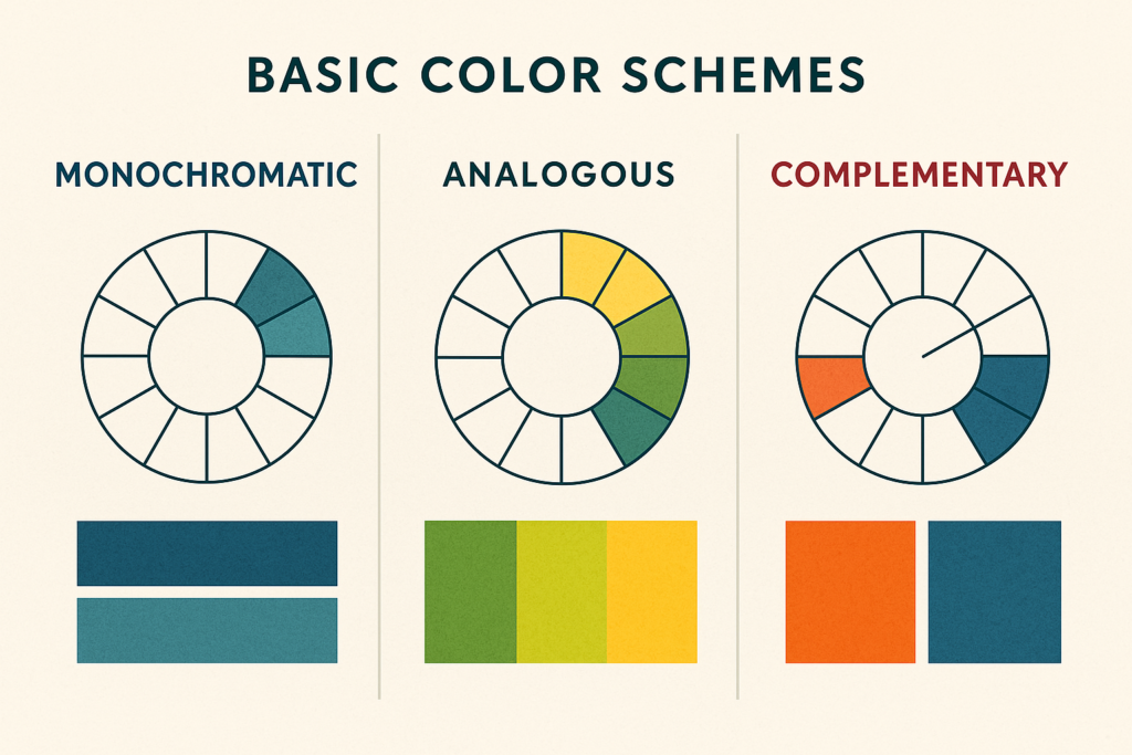
How colors are combined affects the overall mood OLT DESIGN:
Monochromatic: Uses variations (tints, shades, tones) of a single hue. Creates a sophisticated, cohesive, and often calming effect.
Analogous: Uses colors adjacent on the color wheel (e.g., blue, blue-green, green). Creates a harmonious, serene, and low-contrast look.
Complementary: Uses colors opposite on the color wheel (e.g., blue and orange). Creates high contrast, energy, and visual excitement. Best used with one color dominant and the other as an accent.
Triadic/Split-Complementary: Uses three colors equally spaced around the color wheel. Creates a vibrant, balanced yet energetic feel, particularly effective when one color dominates and the others accent.
Personal Insight: After years of exploring design, I’ve found that complementary schemes, while visually striking, can be emotionally jarring if used in equal proportions. I think the 80/20 rule is key – using one color for 80% of the space and its complement for just 20% creates energy without chaos.
Texture Adds Depth
Texture interacts with color and light, influencing mood How Color and Texture Can Influence a Home’s Mood. Rough textures (stone, brick, nubby fabrics) absorb light and can make colors feel darker and cozier. Smooth, shiny textures (silk, gloss paint, metal) reflect light, making colors feel brighter and potentially more energetic or sleek. Incorporating varied textures prevents even neutral palettes from feeling flat.
Transformation Technique: One of my favorite approaches for creating emotional impact is using the same color in multiple textures. I love how a monochromatic blue bedroom using matte paint, velvet upholstery, silk pillows, and glass accessories creates visual interest and emotional depth while maintaining color harmony. The textural variation provides subtle stimulation that prevents the space from feeling flat while preserving the psychological benefits of the chosen color.
Saturation and Value
As mentioned, the intensity (saturation) and lightness/darkness (value) are critical OLT DESIGN. Muted, less saturated colors tend to be more calming and sophisticated. Highly saturated colors are energetic and attention-grabbing. Light values make spaces feel airy and larger, while dark values create intimacy and coziness.
Designer Observation: In my experience, value is often more impactful than hue. A pale green and a pale blue with the same value will create more similar feelings than a pale green and a deep green of the same hue. Understanding this principle helps navigate color decisions when you’re uncertain – match the value to your desired mood (light for airy, dark for cozy) and then select the hue that resonates with you personally.
Emotional Decor: Making It Personal and Authentic
The ultimate goal of applying color psychology is to create emotional decor – spaces that resonate deeply with the inhabitants GreenCity by Matabi. This goes beyond trends and textbook definitions.
Trust Your Intuition
While guidelines are helpful, your personal response to a color is paramount Moretti Interior Design. If a generally “calming” color makes you feel uneasy, don’t use it. If a supposedly “overstimulating” color brings you joy, find a way to incorporate it thoughtfully.
Personal Color Journey: I have a living room painted a soft coral – a color that color psychology might suggest is too stimulating for a relaxation space. Yet for me, it evokes the joy of Mediterranean vacations and sunsets, creating a deeply positive emotional association that transcends traditional guidelines. It reminds me that while science provides valuable frameworks, authentic connection to a color trumps general rules.
Start with Inspiration
Find an object you love – a piece of art, a rug, a fabric swatch – and build your color palette around it. This ensures the scheme has personal meaning.
Method I Use With Friends: Rather than asking “what colors do you like?” (which can lead to safe, generic answers), I ask “what spaces have made you feel most at home?” and “what’s your favorite place you’ve ever visited?” These questions often reveal color preferences rooted in emotional connection rather than trend-based preferences, leading to more authentic and satisfying color choices.
Consider the Inhabitants
Design for who uses the space Foyr Neo. A workaholic might benefit from calming colors to de-stress, while someone prone to low energy might need more stimulating hues. Consider age, personality, and cultural background.
Case Study: I once helped design a multi-generational home with color transitions that subtly supported different needs – energizing yellows in common morning areas, calming blues in evening zones, and adaptive neutrals in shared spaces that could be influenced by accent colors. The result was a home that supported the energy patterns of three generations while maintaining visual harmony.
Embrace Biophilia
Incorporating colors and elements found in nature (greens, blues, browns, wood, stone, plants) taps into our innate connection to the natural world, promoting well-being and reducing stress wllw.eco.
Research Application: Recent studies in biophilic design suggest that natural colors coupled with organic patterns and materials can reduce cortisol levels and improve cognitive function Journal of Environmental Psychology. One of my favorite home office designs combined sage green walls with a live-edge wood desk, natural stone accents, and a pattern of dappled light (created through carefully placed lighting) to mimic the experience of working in a forest clearing – a direct application of biophilic principles to enhance both productivity and well-being.
The 60-30-10 Rule (A Guideline, Not Gospel)
For balance, consider distributing color roughly as: 60% dominant color (usually walls), 30% secondary color (furniture, rugs), and 10% accent color (accessories, art). This helps create harmony and prevents any one color from overwhelming.
Evolution of the Rule: I’ve found that in contemporary design, a modified 70-20-10 ratio often works better, particularly in open-plan spaces where 60% might not provide enough cohesion. Additionally, in spaces designed for specific psychological effects (like sleep improvement or energy stimulation), sometimes pushing the dominant color to 80% allows its psychological properties to fully envelop the experience.
Addressing Misconceptions and Finding Unique Value
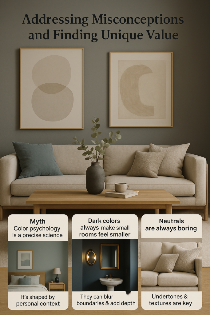
It’s important to debunk common myths and find deeper insights:
Myth: Color psychology is a precise science with universal effects.
Reality: It’s highly influenced by personal experience, culture, and context UX Collective. Effects are often associative rather than inherent biological triggers for complex emotions Happy Home Clinic. Use it as a guide, prioritizing personal response.
Beyond the Basics: Rather than treating color psychology as a set of rigid rules, I think of it as a conversation between space and inhabitant. I’ve seen a “calming” blue bedroom cause anxiety in one person and profound relaxation in another – proof that personal context often outweighs theoretical effects. The most successful applications of color psychology acknowledge this interplay between general principles and individual experience.
Myth: Dark colors always make small rooms feel smaller.
Reality: While dark colors absorb light and can advance visually, they can also blur boundaries and create a sense of depth or cozy intimacy, especially in rooms with good lighting or when used strategically (e.g., below a chair rail, on an accent wall) House Beautiful. Light colors generally make spaces feel larger, but well-executed dark palettes can be sophisticated and enveloping.
Designer Secret: For small spaces without much natural light, I sometimes intentionally “lean in” to darkness rather than fighting it. A small powder room painted in deep navy with strategic lighting creates a jewel-box effect that feels luxurious rather than cramped. This counterintuitive approach acknowledges the room’s natural qualities rather than forcing an inappropriate brightness.
Myth: Neutrals are always boring.
Reality: Neutrals provide essential balance and sophistication. Their impact depends heavily on undertones (warm vs. cool), texture, and the accent colors they support ITALdoors. Layering neutrals creates richness.
Depth Perspective: I think some of the finest all-neutral rooms can be among the most emotionally resonant, using subtle variations in tone, texture, and finish to create spaces of extraordinary sophistication and calm. A living room using seven different shades of warm white and beige, each with slightly different undertones and textures, can create a depth of experience that bold colors could never achieve – proving that neutral doesn’t mean emotionally neutral.
Unique Insight Gap
Many articles list color meanings but fail to adequately stress the interaction between color, light, texture, and personal perception. A truly effective approach considers all these elements holistically Color Psychology: How to Design a Home That Feels Right.
The Integration Perspective: Through years of observing how people respond to spaces, I’ve found that color psychology works most powerfully when integrated with other sensory elements – texture that invites touch, sounds that complement the mood, even scents that align with the color’s emotional intent. A blue room feels more relaxing with soft textures and gentle background sounds; a yellow kitchen more energizing with citrus scents and varied textures. This multisensory approach amplifies color psychology effects in ways that single-sense approaches cannot match.
I think one of the most exciting developments in this field is how neuroscience is beginning to validate what interior design enthusiasts have sensed all along – that our spaces genuinely affect our mental functioning. It’s not just about preference; it’s about how our brains process and respond to environmental stimuli.
Emerging Trends in Color Psychology
As our understanding of human psychology and design evolves, several emerging trends in color psychology deserve consideration:
Neuroaesthetics and Color
The relatively new field of neuroaesthetics uses neuroimaging to study how our brains respond to aesthetic experiences, including color. Early research suggests that color processing involves both emotional and cognitive pathways, confirming what designers have intuitively known – that our response to color is both emotional and intellectual American Institute of Architects.
Application Insight: When designing spaces for individuals with cognitive conditions like ADHD or autism, color choices can be particularly important. Research suggests that cool blues and greens minimize distraction for those with attention challenges, while avoiding high-contrast color combinations can reduce overstimulation for those with sensory sensitivities Psychology Today. This science-based approach moves color psychology from intuitive to therapeutic.
I think one of the most exciting developments in this field is how neuroscience is beginning to validate what interior design enthusiasts have sensed all along – that our spaces genuinely affect our mental functioning. It’s not just about preference; it’s about how our brains process and respond to environmental stimuli.
Sustainable Color Psychology
As environmental consciousness grows, a new dimension of color psychology considers how certain colors connect us to nature and sustainability. Biophilic colors (greens, blues, earthy neutrals) not only have traditional calming effects but can also foster environmental mindfulness Journal of Environmental Psychology.
Design Evolution: One fascinating pattern I’ve observed is that rooms featuring these sustainable color palettes often inspire more environmentally conscious behaviors in their inhabitants – an unexpected but powerful psychological effect that extends beyond the immediate emotional response to color.
The biophilic design movement isn’t just about bringing plants indoors – it’s about creating holistic environments that reconnect us with nature through color, pattern, texture, and form GreenCity by Matabi. Studies show that spending time in spaces with biophilic elements can reduce stress hormones, lower blood pressure, and improve cognitive function ArchDaily.
Cultural Shift and Globalization
As our world becomes more connected, color associations are evolving. Traditional Western color psychology is being enriched by Eastern and Indigenous perspectives, creating more nuanced and inclusive approaches International Journal of Design.
Global Perspective: Working with diverse design influences has shown me how cultural backgrounds influence color perception in fascinating ways. Japanese wabi-sabi colors – muted grays, soft whites, natural browns – reflect cultural values of impermanence and acceptance of imperfection. Meanwhile, Indian design often embraces vibrant colors that might seem overwhelming through a Western lens but carry deep cultural significance for joy and prosperity IDI Australia.
When designing contemporary spaces, I think it’s valuable to consider these cross-cultural perspectives rather than limiting ourselves to Western color psychology traditions. This expanded understanding can lead to richer, more meaningful environments that acknowledge our increasingly global context.
Personalized Color Analysis
Moving beyond generic color recommendations, personalized color analysis considers individual factors like age, personality type, cultural background, and even biology to create truly customized color schemes Moretti Interior Design.
Future Direction: The integration of personality assessments into design processes is revealing fascinating correlations between psychological traits and color preferences. Introverts often respond best to spaces with deeper, more saturated color that creates a sense of sanctuary, while extroverts typically thrive in brighter environments with more color contrast Harvard Business Review. This personalized approach represents the future of color psychology – moving from general principles to precision application.
Practical Implementation Guide: From Theory to Living Color
Transforming color psychology knowledge into beautiful, emotionally supportive spaces requires a thoughtful approach:
Step 1: Self-Assessment
Before choosing colors, assess:
- Your emotional goals for each space (relaxation, energy, creativity, etc.)
- Your personal color responses (which may differ from textbook associations)
- The existing light conditions and architectural features
- Cultural associations that may be personally significant
Tool for Readers: Create a “color journal” for a week, noting spaces where you feel your best and worst, both at home and elsewhere. Look for color patterns in these observations – they often reveal personal color psychology connections you weren’t consciously aware of Martha Stewart.
Step 2: Test Before Committing

Never rely solely on color chips or digital images:
- Paint large sample boards (at least 24″ square) with potential colors
- Move the samples around the room at different times of day
- Live with them for at least 48 hours before deciding
- Observe how they look under both natural and artificial light
- Note your emotional response to each color in different lighting conditions
Designer Secret: I love creating “color corners” by painting two adjacent walls with sample colors, allowing you to experience how colors interact with each other and with the room’s light. This three-dimensional approach reveals nuances that flat samples cannot Seasons in Colour.
Step 3: Build a Complete Palette
A successful color scheme includes:
- A dominant color (walls, large furniture)
- Supporting colors (textiles, secondary furniture)
- Accent colors (accessories, artwork)
- Consider the 60-30-10 distribution as a starting point
Advanced Technique: When creating a palette, I always select colors not just for their individual properties but for how they interact. A calming blue bedroom feels completely different when paired with energizing orange accents versus grounding earth tones OLT DESIGN. These combinations create complex emotional narratives – perhaps energy for morning paired with relaxation in the evening – that address the full spectrum of how you use the space.
Step 4: Consider Color Transitions
In open-concept homes, color transitions between spaces become crucial:
- Create flow with related colors rather than jarring changes
- Use architectural features (archways, columns) as natural transition points
- Consider the emotional journey as people move through your home
Spatial Psychology: One approach I find particularly effective is designing color progressions that support natural daily rhythms – energizing colors in morning-use spaces transitioning to calming ones in evening areas. This creates a home that subtly supports your circadian patterns through environmental color psychology Robern.
Step 5: Evaluate and Adjust
Color psychology is partly subjective, so be prepared to adjust:
- Live with new colors for at least two weeks before making judgments
- Note how the colors affect your mood at different times
- Make small adjustments (accessories, lighting) before repainting
- Remember that color perception changes seasonally with natural light
Long-term Perspective: I’ve noticed that colors that feel perfect in summer might feel wrong in winter due to changing quality of light. I recommend seasonal accent adjustments – cooler accessories in summer, warmer ones in winter – to maintain the desired psychological effect year-round without repainting How Color and Texture Can Influence a Home’s Mood.
The Cutting Edge: Color Psychology and Technology
The intersection of color psychology and technology is creating exciting new possibilities for home environments:
Smart Lighting and Dynamic Color
Programmable lighting systems now allow homes to shift color temperature and even hue throughout the day, supporting natural circadian rhythms and changing emotional needs Unveiling the Secret Power of Color Psychology in Interior Design.
I’m particularly excited about how these systems can help us create spaces that evolve with our needs – cooler, energizing light in morning hours that gradually warms and dims in the evening, supporting natural sleep cycles. These technologies allow us to experience the benefits of multiple color psychologies within a single space.
Virtual Reality Color Testing
Before committing to a color scheme, virtual reality and augmented reality apps now allow homeowners to visualize different options in their actual spaces The Psychology of Color: Elevate Your Home Design with Proven Strategies.
What I love about this technology is how it reduces the hesitation and uncertainty that often leads people to choose “safe” neutral colors rather than more emotionally supportive hues. Being able to virtually experience a bold blue or energizing yellow before committing can empower more confident color choices.
Designing for Digital Wellbeing
As our homes increasingly serve as workspaces, color psychology is being applied to create environments that support digital wellbeing and prevent screen fatigue Nippon Paint Singapore.
One effective strategy I’ve seen is creating contrast between screen-focused areas and rest areas through intentional color zoning. Work zones might feature cool blues and greens that reduce eye strain, while relaxation zones use warmer hues that signal a psychological transition from work to rest.
Table: Modern Color Psychology Applications by Room
Conclusion: Painting Your Personal Sanctuary
The colors we choose to live with are far more than decorative flourishes; they are silent communicators that shape our daily experiences. By understanding the principles of color psychology decor, we gain the power to intentionally craft home mood colors that foster well-being, enhance the functionality of our spaces, and create truly emotional decor that feels authentic and nurturing The Psychology of Color: How Colors Affect Our Mood and Behavior.
Remember that color psychology provides a valuable map, but you are the ultimate navigator. Blend the general knowledge of color effects with your personal experiences, cultural background, and intuitive responses Moretti Interior Design. Pay attention to light, texture, and combination. Don’t be afraid to experiment, to test, and to trust what feels right to you.
What I love most about color psychology is that it gives intention to what might otherwise be arbitrary choices. A blue isn’t just blue because it’s trendy – it’s blue because it supports focus in your home office. That burgundy accent wall isn’t just decorative – it adds warmth and stimulates conversation in your dining area. These thoughtful decisions stack up to create homes that genuinely support how we want to live.
Ultimately, the goal is to create a home that doesn’t just look good, but feels like a true reflection and sanctuary for the people who live there. By painting with intention, you can transform your living spaces into environments that actively support and inspire your best life. The psychology of color gives us a powerful tool – not just for decoration, but for creating environments that nurture our well-being, express our authentic selves, and enhance every moment we spend within them.