
Understanding and Using the 60-30-10 Color Rule for Interior Design
Key Takeaways:
- The Rule Defined: The 60-30-10 rule is a classic interior design guideline suggesting a balanced color palette: 60% dominant color, 30% secondary color, and 10% accent color.
- Creates Balance: This ratio helps distribute color evenly, preventing overwhelm and creating a harmonious, visually appealing space where the eye can move comfortably.
- Color Roles: The dominant (60%) sets the overall tone (often walls/large furniture), the secondary (30%) adds interest (accent chairs/curtains), and the accent (10%) provides personality (decor/pillows).
- Flexible Guideline: While a powerful tool, it’s not rigid. You can adapt it slightly (e.g., 60-25-15 or adding a fourth minor color) to suit your personal style and space.
- Application: Start by choosing your three colors, then strategically apply them to elements based on their visual weight and surface area – walls, furniture, textiles, and accessories.
Choosing colors for a room can feel overwhelming, can’t it? Walk into any paint store, and the sheer number of swatches is enough to make your head spin. How do you pick colors that truly work together? How do you ensure your space feels cohesive and balanced, not chaotic or, perhaps worse, bland?

That’s where a time-tested design principle comes in handy: the 60-30-10 color rule. Think of it as your secret weapon for creating harmonious and visually appealing interiors. It’s a straightforward concept, but understanding its nuances can elevate your design game significantly. Let’s break it down together.
What is the 60-30-10 Color Rule?
At its core, the 60-30-10 rule is a simple ratio used to create a balanced color palette in any given space. It provides a framework for distributing color to ensure harmony and visual interest without overwhelming the senses. It’s a classic decor rule that helps you combine colors easily and achieve a cohesive look, taking much of the guesswork out of the process. Here’s the breakdown:
- 60% Dominant Color: This is your main color, the foundation of your palette. It will cover the largest portion of your room’s visual area. Think of it as the canvas upon which you’ll paint the rest of your design. This color sets the room’s overall tone and anchors the space.
- 30% Secondary Color: This color supports the dominant hue and provides contrast and interest. It takes up roughly half the visual space of the dominant color. This supporting shade adds depth without competing for attention.
- 10% Accent Color: This is your “pop” color. Used sparingly, it adds personality, draws the eye to specific points, and provides that final touch of flair. It should ideally be a bolder or more contrasting shade, used to complement the other two colors.
Imagine getting dressed: your suit or dress might be the 60%, your shirt or blouse the 30%, and your tie, scarf, or jewelry the 10%. The same principle applies beautifully to rooms. This ratio isn’t a strict mathematical formula you need to measure precisely, but rather a guideline for achieving visual balance.

It helps prevent the common mistake of having too many competing colors fighting for attention, which can make a room feel busy or disjointed. It also saves you from the opposite problem – a room that feels too monochromatic and lacks depth. As Lena Gierasinska from Barker and Stonehouse explains in House Beautiful, this rule ensures no single color overwhelms the space while allowing visual interest to shine through.
By assigning clear roles to each color, the 60-30-10 rule provides structure and makes the color selection process much more manageable. I believe the real strength of the 60-30-10 rule lies not just in balance, but in simplifying the often-paralyzing decision-making process of choosing colors. It provides a clear starting point and a logical path forward, which is incredibly helpful when faced with endless possibilities. Furthermore, as Martin Waller of Andrew Martin notes, it’s a great tool for creating cohesive and comforting living areas by considering each element using this ratio.
Why Does This Rule Create Balance?
The magic of the 60-30-10 rule lies in how it appeals to our natural sense of visual order and balance. Our eyes crave harmony, and this ratio provides it by creating a clear hierarchy among the colors in a space. The dominant color (60%) acts as an anchor, grounding the space and setting the overall mood.
Because it covers the most area, it provides a sense of calm and cohesion. It serves as the backdrop that allows the other colors to shine without becoming overwhelming. Think about nature – a vast blue sky (dominant), green hills (secondary), and pops of colorful wildflowers (accent). This natural balance is inherently pleasing to the eye, and the 60-30-10 rule mimics this principle indoors. It helps the eye move comfortably from one focal point to the next.
🧠 Did You Know?
Our brains are wired to seek patterns and order. When colors are distributed in a predictable yet interesting ratio like 60-30-10, it reduces cognitive load. This means our minds don’t have to work as hard to process the visual information, leading to a feeling of calm and satisfaction in the space.
The secondary color (30%) is crucial because it adds necessary contrast and depth without competing with the dominant hue. It breaks up the monotony of the main color and introduces another layer of visual interest. As stated by color expert Annie Sloan, the secondary color is often a bit bolder than the main color. It has enough presence to be noticed and contribute significantly to the scheme but doesn’t steal the show entirely.

This interplay between the dominant and secondary colors creates a dynamic yet stable foundation. According to Houzz, if everything competes to be the main feature, you wouldn’t know where to look. This rule makes the stars of the show more obvious, guiding perception effectively and preventing visual clutter.
Finally, the accent color (10%) acts like punctuation in a sentence – or perhaps the spice in a recipe. It’s used sparingly but strategically to draw attention, add excitement, and inject personality. It provides those little sparks of visual energy that prevent the room from feeling flat or predictable.
Because it’s only 10%, it doesn’t overwhelm the space or clash jarringly with the primary and secondary colors. Instead, it guides the eye around the room, highlighting key features or objects. From my perspective, the 10% accent color is where a room truly comes alive, acting as the ‘signature’ of the space and reflecting the homeowner’s unique taste.
This carefully managed distribution ensures that no single color dominates inappropriately and that the overall effect is pleasing, comfortable, and intentional. It creates a rhythm and flow that makes a space feel complete and well-designed.
Selecting Your Dominant (60%) Foundation Color
Choosing your dominant color is arguably the most critical step, as it sets the stage for everything else. This color will cover the most significant surface areas, heavily influencing the room’s overall atmosphere. So, what typically carries this 60%?

- Walls: This is the most common application. Painting the majority of the walls in your dominant hue instantly establishes the foundation.
- Large Furniture Pieces: A large sofa, sectional, or extensive cabinetry can also represent your dominant color, especially if the walls are a more neutral shade.
- Large Area Rugs: A significant rug can serve as the dominant color, particularly in rooms with neutral walls and furniture.
- Flooring or Ceiling: While less common for the *main* color focus, these large surfaces can certainly carry the dominant hue, especially with bold flooring choices or painted ceilings.
When selecting this foundational hue, consider several factors. First, think about the mood you want to create. Soft blues and greens evoke calmness (cool hues), while warm colors like reds, oranges, and yellows are energetic. Neutrals like beige, gray, or off-white create balance, coziness, and flexibility.

Second, consider the size and light of the room. Lighter dominant colors tend to make small spaces feel larger and airier, reflecting more light. Darker shades can make a large room feel more intimate and cozy but require ample natural or artificial light to avoid feeling gloomy or cave-like.
Third, look at existing elements you can’t or don’t want to change, like flooring, architectural features (wood trim, fireplaces), or even the view outside your window. Your dominant color should harmonize with these fixed components. Neutrals (whites, creams, grays, beiges) are popular choices for the 60% because they offer flexibility and longevity, allowing you to easily swap out secondary and accent colors later. The Spruce highlights their timeless appeal and adaptability.
However, don’t be afraid of using actual color! A soft sage green, a dusty blue, or a warm terracotta can be stunning dominant choices that infuse the room with personality right from the start.
A crucial insight here, born from my own trial-and-error, is to always test paint samples on different walls within the room. Observe them at various times of day (morning light, afternoon sun, evening artificial light) before committing. Lighting dramatically impacts how color appears in a space, and what looks perfect on a small chip under store lights can look surprisingly different on a large wall in your home environment. This step saves potential heartache and repainting!
Choosing Your Secondary (30%) Supporting Hue
Once your dominant foundation is set, it’s time to choose the secondary color – the supporting act that adds depth and interest. Occupying roughly half the visual space of your dominant color, the secondary hue needs to work harmoniously while still providing noticeable contrast. Think of elements like:
- Accent Walls: Painting one wall in your secondary color can create a strong focal point without overwhelming the room.
- Furniture: Armchairs, side chairs, ottomans, headboards, dining chairs, or even painted furniture like dressers or consoles are excellent candidates.
- Textiles: Curtains, bedding (duvet covers, quilts), or a smaller area rug can effectively introduce the secondary color and add softness.
- Cabinetry: Kitchen or bathroom cabinets painted in the secondary hue can make a stylish statement, especially against neutral walls.
Selecting your secondary color involves considering its relationship with the dominant hue. Do you want a subtle, analogous scheme (colors next to each other on the color wheel, like blue and green)? Or perhaps a more dynamic, complementary one (colors opposite each other, like blue and orange, used thoughtfully)? The secondary color should be distinct enough from the dominant one to be clearly noticeable but shouldn’t clash or fight for attention.

Consider the value (lightness or darkness) and intensity (brightness or saturation) of the colors. A light grey dominant color might pair beautifully with a richer, mid-tone blue secondary color for elegant contrast. Texture also plays a significant role here; a secondary color introduced through a plush velvet chair feels very different than the same color on a flat-painted accent wall. This is your chance to layer in more personality than the often-neutral dominant color allows.
It’s my observation that beginners often struggle most with the 30% secondary color, finding it harder to commit to than the dominant foundation or the fun accent pop. My advice is to view it as the bridge: it needs to connect the foundation (60%) with the flair (10%). If your dominant color is neutral, the secondary color can be where you introduce your main chromatic theme. If your dominant color is already quite bold, your secondary might be a calmer neutral or a less saturated version of a complementary hue. Remember, you’ll use about half as much of this color as your main color, ensuring it supports without overpowering.
Picking Your Accent (10%) Color for Impact
The accent color is the final flourish, the spark that brings your color scheme to life. Though it covers the smallest area (just 10%), its impact can be significant. This is where you can afford to be bolder, brighter, or more adventurous without overwhelming the space. The role of the accent color is to:

- Inject Personality: Show off your unique style and preferences.
- Create Focal Points: Draw the eye to specific areas or objects, much like highlights are used in UI design to guide attention.
- Add Visual Energy: Prevent the scheme from feeling too staid or predictable.
- Tie the Look Together: Often, the accent color can subtly link different elements in the room, creating a cohesive thread.
Think small but mighty when distributing your accent color. Good candidates include:
- Throw Pillows and Blankets: Easy to change seasonally or when you want a refresh, and great for adding pops of color and texture.
- Artwork: Paintings, prints, or photographs often provide natural accent colors – you can even pull your accent color from a piece of art you love.
- Decorative Objects: Vases, bowls, candles, picture frames, sculptures.
- Lampshades or Lamp Bases: Can provide a surprising and effective touch of color.
- Single Small Furniture Piece: A small side table, a footstool, or even the inside back of a bookshelf painted in a vibrant hue.
- Pattern Details: An accent color might appear within the pattern of curtains, upholstery, or rugs.
- Plants or Flowers: Can introduce natural accent colors, changing with the seasons.
When choosing your 10%, look for a color that contrasts nicely with both your dominant and secondary hues. It could be a complementary color to one of your main choices (like yellow accents in a blue and grey room), a vibrant shade that stands out against neutrals, or even a metallic finish like gold, silver, copper, or brass, which function brilliantly as accents, adding a touch of glamour or industrial edge.

The key is distribution. Don’t cluster all your accent pieces in one spot. Instead, sprinkle them thoughtfully throughout the room – perhaps in three distinct locations – to lead the eye naturally from one point to another. A splash of yellow on a cushion here, a yellow detail in artwork across the room, and a small yellow vase on a shelf create a cohesive visual triangle. Be mindful not to overdo it – too much accent color defeats the purpose and can make the space feel cluttered rather than curated. It’s the careful, deliberate placement that gives the 10% its power, making the space feel balanced and interesting.
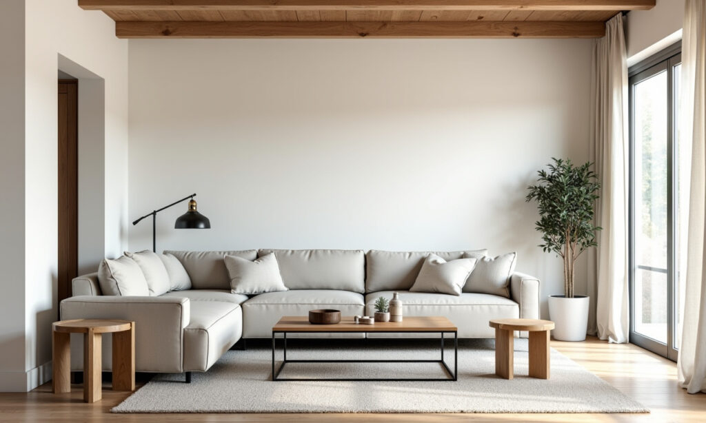
Applying the 60-30-10 Rule Step-by-Step
[ image goes here ]
Ready to put the rule into practice? Here’s a practical approach to get you started:
- Find Your Inspiration: Start with something you love – a piece of art, a vibrant rug, a fabric swatch, or even an outfit or a landscape photo. This can often provide your initial three colors. Alternatively, browse design magazines or online platforms (like Pinterest or Instagram) for color palettes that resonate with you. As suggested by Sara Lynn Brennan Interiors, starting with the largest piece of furniture, like a sofa, can also be a good anchor point.
- Select Your Three Colors: Based on your inspiration and the mood you want, designate your dominant (60%), secondary (30%), and accent (10%) colors. Remember the roles each color plays. Consider using tools like the color wheel or online palette generators to find harmonious combinations (analogous, complementary, triadic). The Everygirl emphasizes limiting your main palette to three colors using this rule for optimal balance. Check their undertones (cool vs. warm) to ensure they work well together.
- Start with the Dominant (60%): Apply your main color first, usually to the largest surfaces. This typically means painting the walls. If walls are staying neutral, identify the largest furniture item (like a sofa) or rug that will carry this color. This anchors the space and sets the overall tone.
- Layer in the Secondary (30%): Introduce your secondary color through medium-sized elements distributed around the room. Think about curtains, accent chairs, bedding, smaller rugs, an accent wall, or painted furniture. Aim for pieces that collectively make up about half the visual weight of your dominant color.
- Sprinkle the Accent (10%): Strategically place your accent color using smaller items. Distribute pillows, throws, artwork, and decor objects featuring this hue throughout the space. Ensure it appears in at least three different spots to create that visual triangle, guiding the eye and adding sparks of interest. Use this color for items you want to draw attention to.
- Consider Texture and Pattern: Within each color slot, incorporate different textures (e.g., a chunky knit throw for the accent, smooth leather for the secondary) or patterns (e.g., patterned curtains for the secondary color featuring the dominant and accent hues). This adds depth and interest without introducing new colors, making the space feel richer and more layered. As Livingetc points out, applying the rule thinking about textures and patterns as well as color leads to more interesting spaces. A valuable insight often overlooked is how texture interacts with color perception; a matte 60% color feels vastly different from a high-gloss one, affecting the entire mood and light reflection.
- Review and Adjust: Step back and look at the room critically. Does it feel balanced? Is the eye drawn comfortably around the space? Does it evoke the mood you intended? Don’t be afraid to tweak. Maybe you need one more accent pillow, or perhaps the secondary color feels a bit too strong and needs toning down with a neutral throw draped over the chair. The 60-30-10 is a guide, not dogma. Trust your eye and adjust proportions slightly if needed (e.g., 60-25-15 or even 60-30-10-10 by adding a second small accent like a metallic). Remember, the goal is a space that feels right to *you*.
Table 1: Typical Placement for 60-30-10 Colors
This table provides common examples of where each percentage might be applied in a room. Remember, these are flexible suggestions, not strict rules!
| Percentage | Role | Common Elements |
|---|---|---|
| 60% | Dominant / Foundation |
|
| 30% | Secondary / Supporting |
|
| 10% | Accent / Personality Pop |
|
Real Room Examples: The 60-30-10 Rule in Action

Seeing the rule applied helps solidify the concept. Let’s visualize a few scenarios to see how versatile this guideline can be:
Example 1: Calm & Cozy Living Room
- 60% Dominant: Soft Greige (Walls, large neutral sofa) – Creates a warm, inviting, and versatile backdrop.
- 30% Secondary: Muted Teal Blue (Curtains, two armchairs, pattern in the area rug) – Adds a layer of calm color and sophistication without being overpowering.
- 10% Accent: Burnt Orange (Throw pillows on sofa and chairs, vase on the coffee table, details in artwork) – Provides pops of warmth and visual interest, complementing the teal beautifully.
Why it works: The greige provides a neutral canvas, the teal adds personality and depth, and the burnt orange injects energy sparingly, drawing the eye around the comfortable space. The balance prevents any one color from feeling overwhelming and creates a cohesive, relaxing atmosphere.
Example 2: Modern & Energetic Bedroom (Using Pattern)
- 60% Dominant: Deep Green (Feature wall behind bed with patterned wallpaper incorporating green, plus solid green bedding) – The green elements anchor the space, providing a lush foundation.
- 30% Secondary: Warm Gold/Brass (Lighting fixtures, mirror frame, legs on bedside tables) – Metallic finishes act as the secondary color, adding warmth and modern contrast.
- 10% Accent: Blush Pink (Velvet throw pillow, flowers on bedside table, small details in the wallpaper pattern) – Ties everything together with small, soft, vibrant touches against the deep green.

Why it works: Even with pattern and metallics, the rule provides structure. The green grounds the room, the gold adds sophisticated warmth, and pink accents offer gentle focal points, creating a dynamic yet cohesive feel. This demonstrates the rule’s flexibility beyond just solid paint colors.
Example 3: Minimalist Dining Room with Natural Elements
- 60% Dominant: Crisp White (Walls, ceiling, simple pendant light) – Creates a bright, clean, and expansive feel, maximizing light.
- 30% Secondary: Natural Wood Tones (Oak dining table, chairs with woven seats, wood flooring) – Adds warmth, texture, and organic feel as the supporting element.
- 10% Accent: Black (Thin metal chair legs, minimalist artwork frame, simple black vase on the table) – Provides sharp contrast and a grounding graphic element, defining the space.
Why it works: This shows the rule applies effectively even to minimalist or highly neutral palettes. The white maximizes light, the wood adds essential warmth and texture, and the black provides necessary definition and focus without clutter. The balance feels intentional and sophisticated.

These examples show the versatility of the rule. The specific color choices define the style – from cozy traditional to sleek modern – but the ratio ensures the result feels balanced and intentional, whether you prefer subtle neutrals or bold contrasts.
Common Mistakes to Avoid When Using the Rule
While the 60-30-10 rule is incredibly helpful, it’s easy to misstep, especially when you’re starting out. Here are common pitfalls to watch out for:
- Being Too Rigid: Remember, it’s a guideline, not an unbreakable law. Don’t get so caught up in precise percentages that you stifle creativity or ignore what looks right in *your* space. Sometimes slight variations like 65-25-10 or adding a second 10% accent (60-30-10-10, perhaps for a metallic) work better. Trust your eye; the goal is visual harmony, not mathematical purity.
- Ignoring Undertones: Choosing three colors that technically fit the ratio but have clashing undertones (e.g., a cool blue-grey dominant with a warm yellow-beige secondary) can result in a discordant, “off” look. Pay attention to whether colors lean cool (blue, green, purple hints) or warm (yellow, orange, red hints) and try to keep them compatible, or use true neutrals strategically to bridge them.
- Poor Accent Color Distribution: Clustering all your 10% accent pieces in one corner makes that area feel heavy and leaves the rest of the room unbalanced. Sprinkle the accent color throughout the space – think of creating a visual triangle – to create flow and rhythm. Designers often notice when accents aren’t spread effectively to lead the eye.
- Forgetting Texture and Pattern: Relying solely on solid blocks of color can make a room feel flat and uninspired, even with a balanced ratio. Incorporate varied textures (wood grain, metal sheen, velvet pile, linen weave) and potentially patterns within your chosen color slots to add depth, tactile interest, and sophistication. Lack of textural variation, even within a neutral scheme, can be surprisingly boring.
- Choosing Colors in Isolation: Selecting colors under harsh store lighting or without considering your room’s natural light levels and existing finishes (flooring, trim, furniture you’re keeping) is a common mistake. Always test large samples (paint swatches painted on boards, fabric samples) in your actual space at different times of day. Lighting dramatically affects color perception – a mistake even professionals strive to avoid by testing on-site.
- Making Secondary or Accent Too Timid: The secondary color needs enough contrast from the dominant to add interest, and the accent needs to actually *pop*. If they are too close in value (lightness/darkness) or intensity (brightness) to the dominant color, the scheme can look muddy, washed-out, or one-dimensional. Don’t be afraid to let them play their distinct roles effectively.
- Too Many Competing “Wow” Factors: If your dominant color is very bold or features a large-scale pattern, calmer secondary and accent choices might be needed for balance. Similarly, avoid pairing highly saturated, “vibrating” colors directly against each other in large amounts, as it can be visually jarring. This principle of avoiding excessive visual competition is also relevant in fields like UI design for clarity.
Table 2: Fixing Common 60-30-10 Mistakes

Here’s a quick guide to recognizing and correcting frequent errors when applying the color rule.
| Mistake | Problem It Causes | Solution |
|---|---|---|
| Being Too Rigid | Stifled creativity, potentially awkward results if forced, ignores room specifics. | Use as a guideline; allow slight variations (e.g., 60-25-15, 60-20-10-10); trust your eye over strict math. |
| Clashing Undertones | Colors feel “off” together, look jarring, muddy, or visually uncomfortable. | Identify undertones (warm/cool/neutral); choose colors with compatible undertones or use true neutrals to bridge. Test samples together *in situ*. |
| Poor Accent Distribution | Uneven visual weight, lack of flow, cluttered spots, accent loses impact. | Sprinkle accent items in at least 3 locations around the room (visual triangle) to create rhythm and guide the eye effectively. |
| Lack of Variation (Texture/Pattern) | Room feels flat, one-dimensional, boring, sterile, lacks depth. | Incorporate varied textures (wood, metal, fabrics) and potentially subtle patterns within color percentages. Use different shades/tints of a color if going monochromatic. |
| Ignoring Room Context (Light/Fixed Items) | Colors look different than expected; clashes with flooring, trim, existing furniture. | Test large color samples *in the room* under different lighting conditions (day/night); choose colors that harmonize with fixed elements. |
| Colors Too Similar / Lack Contrast | Lack of interest, scheme looks muddy or washed out, roles aren’t clear. | Ensure sufficient contrast in value (light/dark) and/or intensity (bright/muted) between dominant, secondary, and accent colors so each stands out appropriately. |
Adapting the Rule for Different Interior Styles
The beauty of the 60-30-10 rule is its remarkable adaptability across various design aesthetics. The ratio provides the essential balance, but the specific colors, textures, and materials you choose within that ratio will define the room’s style.

What I find fascinating is how this simple framework can underpin vastly different looks while consistently delivering that crucial sense of order and cohesion. Here’s how you might see it applied:
Minimalist: Focuses on simplicity, clean lines, and a tightly curated palette, often neutral.
- 60%: Crisp White or Very Light Gray (Walls, ceiling, main uncluttered surfaces)
- 30%: Light Gray, Black, or Natural Wood (Sofa, key furniture pieces, flooring)
- 10%: Black or a single subtle color (Metal accents, thin frames, minimal decor, perhaps a single plant)
- Focus: Lack of clutter, subtle textural variations (smooth vs. matte), emphasis on form and negative space.
Scandinavian: Light, airy, functional, emphasizing natural elements and cozy textures (hygge).
- 60%: Pale Gray, Off-White, or Soft White (Walls, large furniture like sofa)
- 30%: Light Natural Wood Tones (Flooring, furniture legs, shelving, accents) – Wood often acts as the secondary ‘color’.
- 10%: Muted Blue, Dusty Pink, Soft Green, or Black (Pillows, throw, simple graphic art, ceramics)
- Focus: Maximizing light, functionality, natural materials (wood, wool, linen), comfort, simplicity.
Bohemian: Eclectic, layered, textured, often using warmer, earthier tones and collected, global-inspired items.
- 60%: Warm Terracotta, Olive Green, Deep Cream, or even a Rich Jewel Tone (Walls, large rug, main upholstery)
- 30%: Mixed Patterns & Textures in Earth Tones (Layered rugs, patterned poufs/curtains, rattan/wicker furniture, macrame) – Can be a blend of related colors/textures rather than one solid hue.
- 10%: Mustard Yellow, Deep Magenta, Teal, Burnt Orange (Accent pillows, tassels, pottery, vibrant art, plants)
- Focus: Layering textures and patterns, plants, global influences, relaxed and unconventional vibe, personal expression.
Modern Farmhouse: Blends rustic charm (wood, shiplap, vintage finds) with modern clean lines and often a neutral base.
- 60%: Off-White, Cream, or Light Gray (Shiplap walls, main sofa, cabinetry)
- 30%: Black or Charcoal Gray (Window frames, light fixtures, metal accents, contrast furniture like dining chairs or island)
- 10%: Natural Wood Tones or Muted Green/Blue (Exposed beams, wooden stools, subtle greenery, vintage-style textiles)
- Focus: Comfort, practicality, mix of old/new, neutral palette balanced with texture (wood, metal, linen), approachability.
Monochromatic: Uses varying shades, tints, and tones of a single core color for a sophisticated look.
- 60%: Lightest shade/tint (e.g., Pale Blue walls)
- 30%: Mid-tone shade (e.g., Medium Blue sofa/chairs)
- 10%: Darkest shade/tone (e.g., Navy Blue accents like pillows, vase, or artwork details)
- Focus: Sophisticated, calming, relies heavily on texture and strong value contrast within the single hue to create interest and avoid flatness, as demonstrated in successful monochromatic applications.
These examples illustrate that the rule provides structure regardless of style. Your dominant color might come from walls or large furniture, the secondary from textiles or accent chairs, and the accent from small decor, but the proportional balance remains key to achieving a polished look. You can even apply the concept creatively to patterns and textures within the color framework.
Mastering the 60-30-10 Rule: Key Tips for Success

To truly master this principle and use it effectively in your own home, transforming your spaces from uncertain to intentional, keep these final tips in mind:
- Start with an Inspiration Piece: Finding a rug, artwork, fabric, or even a photograph you love often makes choosing your three colors much easier, as a harmonious palette may already be present within it. Let that piece guide your dominant, secondary, and accent choices.
- Use the Color Wheel (But Don’t Be Ruled By It): Understanding basic color relationships helps. Analogous colors (neighbors on the wheel) create serene, low-contrast schemes. Complementary colors (opposites) create high-contrast, dynamic looks (best used with one as dominant/secondary and the other as a small accent). Triadic schemes (three evenly spaced colors) can be vibrant. Use these as starting points, not rigid formulas.
- Don’t Forget Neutrals: Neutrals (whites, creams, grays, beiges, blacks, wood tones) can be part of your 60-30-10 scheme (e.g., a white dominant) or act as a visual “breathing room” between your chosen colors (e.g., white trim, beige floor, black frames). They provide essential balance and prevent color overload.
- Consider Flow Between Rooms: Especially in open-plan homes, think about how colors transition. You don’t need the exact same scheme everywhere, but aim for some continuity. Perhaps use one consistent neutral throughout, or let an accent color in one room become a secondary color in the adjacent space to create a cohesive journey. More separate rooms allow for more distinct palettes.
- Texture is Your Secret Weapon: Incorporating different textures enhances the colors and adds sophistication, preventing even simple palettes from feeling flat. Think about a shiny metallic accent, a matte dominant wall, a nubby linen secondary chair, a smooth wooden table – texture adds another layer of vital interest.
- Test, Test, Test: I can’t stress this enough! Never rely solely on small paint chips or screen images. Get large samples (at least 12×12 inches, or paint on poster board) and test them in your space. Look at them on different walls, at different times of day, under both natural and artificial light. This step is non-negotiable for accurate color representation and avoiding costly mistakes.
- Trust Your Gut & Allow Flexibility: Ultimately, interior design is deeply personal. The 60-30-10 rule is a fantastic starting point and a powerful tool for achieving balance, but if you find yourself loving a slightly different proportion, or feel your space needs a tiny fourth color pop (e.g., 60-30-10-10), feel free to adjust. I believe the most successful and loved spaces are those that blend established guidelines with personal intuition and aren’t afraid to experiment a little. The goal is a space *you* truly love living in.
Conclusions: Your Path to Balanced and Beautiful Color

The 60-30-10 color rule is a powerful yet refreshingly simple guideline that demystifies the often daunting process of choosing and combining colors for your interiors. By assigning specific roles and proportions – 60% for your dominant foundation, 30% for your supporting secondary hue, and 10% for your personality-filled accent – you can create spaces that feel harmonious, balanced, visually compelling, and uniquely yours.
It effectively prevents color chaos on one hand and bland monotony on the other, ensuring a cohesive look that guides the eye comfortably through the space. It’s a foundational principle that empowers anyone, regardless of experience level, to make more confident and successful color choices.
Remember, it’s a flexible framework, not a rigid constraint. Use it as your starting point, your trusty guide, to build confidence in your color choices and develop your own unique style. Let it be the tool that helps you translate your vision into a beautifully realized room.
Here are your actionable steps to get started:
- Assess Your Space: Consider its size, natural light, existing finishes you need to work with, and the overall mood or feeling you want to create.
- Find Inspiration: Look for a piece (art, rug, fabric) or an image with a color scheme that resonates with you and aligns with your desired mood.
- Select Your Trio: Choose your dominant (60%), secondary (30%), and accent (10%) colors based on your inspiration and assessment. Double-check that their undertones are compatible.
- Apply the Ratio: Start applying the colors, beginning with the largest surfaces (dominant), then layering in secondary elements, and finally sprinkling the accent color strategically (aim for at least 3 spots for visual flow).
- Incorporate Texture & Pattern: Add depth and tactile interest within your chosen color percentages to elevate the scheme beyond flat color blocks.
- Review & Refine: Step back frequently, evaluate the balance and overall effect, and make small adjustments as needed. Trust your eye and personal preference; adapt the rule slightly if necessary to achieve the perfect feel for *your* home.
By following these steps and using the 60-30-10 rule as your guide, you’ll be well on your way to creating beautifully balanced, cohesive, and personalized rooms that you’ll love spending time in for years to come.
References
- Baker Design Group. (n.d.). Design Color Mistakes to Avoid! Retrieved from https://baker-designgroup.com/blog/design-color-mistakes-to-avoid/
- Havenly. (2024, September 13). The 10 “Ugly” Color Palette Mistakes Interior Designers Always Notice. Retrieved from https://havenly.com/blog/color-palette-mistakes
- Houzz. (n.d.). The Golden Rules for a Balanced Colour Scheme. Retrieved from https://www.houzz.co.uk/magazine/the-golden-rules-for-a-balanced-colour-scheme-stsetivw-vs~70216199
- House Beautiful. (Multiple Dates). How to Use the 60-30-10 Color Rule. Retrieved from https://www.housebeautiful.com/uk/decorate/advice/a42354217/60-30-10-colour-rule/
- Livingetc. (2022, August 24). A decorator’s guide to the 60-30-10 rule and how to use it to create your color scheme. Retrieved from https://www.livingetc.com/advice/60-30-10-rule
- Medium (Bryson M.). (2022, October 30). 60–30–10 Rule: How to Choose Colors for Your UI Design. Retrieved from https://medium.com/@brysondezigns/60-30-10-rule-how-to-choose-colors-for-your-ui-design-5e6345c557c0
- Sara Lynn Brennan Interiors. (n.d.). A Simple Design Rule [That Just Might Blow Your Mind]. Retrieved from https://www.saralynnbrennan.com/blog/60-30-10-rule
- The Everygirl. (2024, September 5). The 60-30-10 Rule Is the Secret to Decorating a Cohesive Home. Retrieved from https://theeverygirl.com/60-30-10-color-rule/
- The Spruce. (2024, April 22). Perfecting the 60-30-10 Rule in Your Living Space. Retrieved from https://www.thespruce.com/timeless-color-rule-711169
- UX Collective (Adelugba, A.). (n.d.). How the 60–30–10 rule saved the day. Retrieved from https://uxdesign.cc/how-the-60-30-10-rule-saved-the-day-5ab44f2548e2