
The Hidden Science of Harmonious Spaces: How Proportions Shape Interior Design
TLDR;
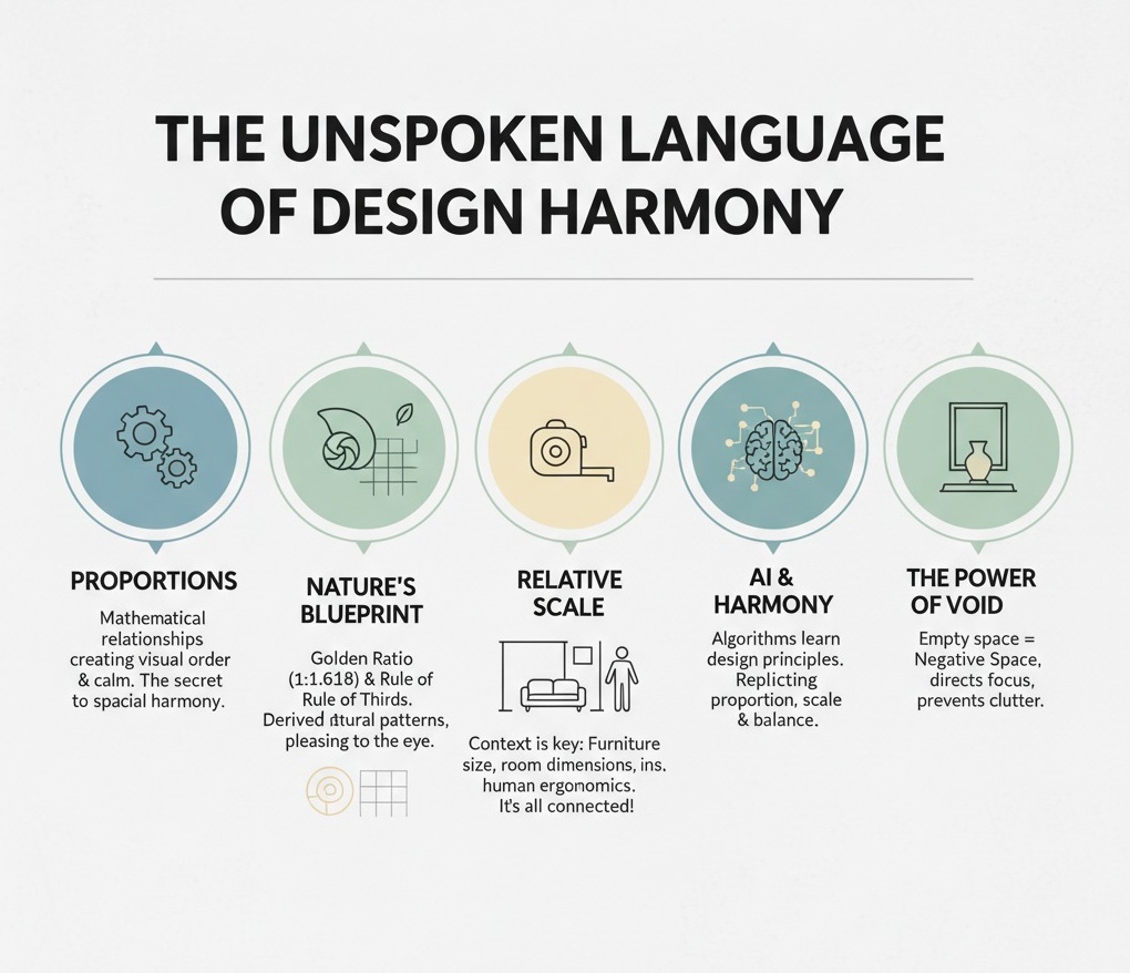
- Proportions are the unspoken language of design. They are mathematical relationships between objects that create a sense of visual order, calm, and spatial harmony in a space.
- Nature provides the ultimate design blueprint. Timeless interior design principles like the Golden Ratio (1:1.618) and the Rule of Thirds are derived from patterns found in nature and art, making them inherently pleasing to the human eye.
- Scale is relative, and it’s all about context. The success of a design hinges on the relationship between the size of your furniture, the dimensions of your room, and your own human scale (ergonomics).
- AI is learning the rules of harmony. Modern generative AI systems for interior design don’t just randomly place objects; they use complex algorithms to replicate the principles of proportion, scale, and balance in design that human designers have used for centuries.
- Empty space is as important as filled space. Negative space, or the “void,” is a powerful tool for creating balance, directing focus, and preventing a room from feeling cluttered and chaotic.
*
Have you ever walked into a room and felt an immediate sense of calm and order? Everything just feels right.The furniture seems perfectly placed, the art is at the perfect height, and there’s a feeling of effortless balance. This isn’t an accident or a matter of pure luck; it’s the result of a powerful, often invisible force at play: proportion.
For centuries, designers, artists, and architects have understood that the mathematical relationships between objects and the spaces they inhabit are the secret to creating aesthetically pleasing environments. But in an age of rapidly advancing technology, these classic principles are more relevant than ever. I’ve been fascinated by recent research into generative AI for interior design, where computer scientists are essentially trying to teach machines the foundational rules of spatial harmony. What they’re discovering is what great designers have always known: proportion isn’t just a guideline, it’s the very science of a beautiful room.
What I find truly compelling is how these AI models confirm that good design isn’t arbitrary. To create a believable space, a system like DiffDesign must learn a “meta prior,” a set of foundational rules about how objects relate to one another.This tells us that the principles we’re about to explore are not just matters of taste, but are deeply embedded in our perception of a logical, functional, and beautiful world.
In this deep dive, we’ll explore that hidden science. We’ll decode the timeless principles that govern visual harmony, from nature’s secret formulas to the practical rules of furniture scaling. We’ll also look at how these principles are being translated into the algorithms shaping the future of design, proving that good design is a perfect blend of art and science.
Decoding Spatial Harmony: Why Proportions Are Your Most Powerful Design Tool
At its core, proportion is about the relationship between objects. It’s the size of one object compared to another, or the size of an object compared to the space it occupies. When these relationships are balanced and logical, our brains perceive the environment as harmonious and orderly. When they’re off, a room can feel chaotic, cramped, or just plain unsettling, even if we can’t pinpoint exactly why.

Think of it like a musical chord. Individual notes are fine on their own, but when combined in the right mathematical relationship, they create a harmonious sound that is deeply satisfying. Proportions in design work the same way.A beautiful chair, a stunning rug, and a striking piece of art are the individual notes. Proportion is the chord they create together, creating a symphony of balance in design.
This concept isn’t just poetic; it’s being quantified in the world of computational design. Researchers are grappling with this very idea, trying to teach machines how to “see” these relationships. Papers on generative AI, like FlairGPT and I-Design, reveal that you can’t just tell a machine to “make a nice living room.” The AI has to be given a complex set of rules and constraints—many of which are based on proportion—to generate a layout that is both functional and aesthetically pleasing.These systems use “layout constraint graphs” and “optimization” solvers to place objects, essentially replicating the decision-making process of a human designer who instinctively understands proportional rules.
I think this is a crucial insight because it validates these timeless principles with modern data. The AI has to balance aesthetics, functionality, and practicality, all of which are governed by the relative size and placement of objects. This tells us that proportion isn’t just a “nice-to-have”; it’s a fundamental, non-negotiable tool for creating successful spaces.
When these elements come together correctly, the result is a room that not only looks good but also feels good. It supports our activities, allows for easy movement, and provides a sense of psychological comfort. The lack of jarring visual relationships allows our minds to relax, making the space a true sanctuary from the outside world. This emotional response is the ultimate goal of achieving perfect room proportions.

The Golden Ratio: Nature’s Secret to Aesthetically Pleasing Rooms
One of the most famous and enduring proportional principles is the Golden Ratio, a mathematical relationship often expressed as 1:1.618. This “divine proportion” is found everywhere in nature, from the spiral of a seashell to the branching of trees and the proportions of the human face. Because it’s so deeply embedded in the natural world, our eyes are subconsciously trained to find it beautiful and balanced.
Applying the Golden Ratio in interior design can instantly elevate a space from ordinary to extraordinary. Here’s how it works in practice:
- Arrangement and Layout: You can use the ratio to divide a room into zones. In a living room, the main seating area might occupy the larger portion of the space (the 1.618 part), while a smaller secondary area, like a reading nook, occupies the smaller portion (the 1 part). This creates a natural and pleasing division of space.
- Furniture Sizing: The ratio can guide furniture selection. A coffee table should be approximately two-thirds (which is close to 1/1.618) the length of the sofa it serves. This ensures the table feels substantial enough for the sofa without overpowering it.
- Art Placement: The ideal height to hang art isn’t just “eye level.” A large piece of art often looks best when its center is hung 57-60 inches from the floor, a measurement derived from the average human height and related to creating a balanced sightline. When hanging art above a sofa, it should ideally occupy about two-thirds of the sofa’s width.
Did you know that the Parthenon in Athens, one of the most celebrated architectural achievements in history, was designed using the Golden Ratio to determine the proportions of its facade?

However, it’s important to approach the Golden Ratio with a bit of flexibility. I believe that strict adherence can sometimes lead to sterile designs. While its historical and natural significance is undeniable, some designers argue its importance is sometimes overstated. The real value isn’t in measuring everything to the third decimal point, but in understanding the underlying principle: creating a hierarchy of spaces and objects that feels natural and visually resolved.
Interestingly, modern studies on aesthetic preferences, like one titled “Modeling Aesthetic Preferences in 3D Shapes,” confirm that geometric properties like symmetry and proportionality are key drivers of what humans find appealing.While they might not explicitly test for the Golden Ratio, their findings that balanced proportions consistently rank higher in human preference support the idea that these mathematical harmonies are hardwired into our perception of beauty.
Beyond the Golden Ratio: The Rule of Thirds and Other Key Principles
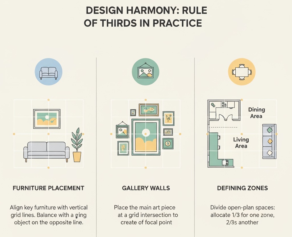
While the Golden Ratio is a powerful tool, it’s not the only proportional principle in a designer’s toolkit. Another incredibly useful and easy-to-apply concept is the Rule of Thirds. Borrowed from photography and painting, this principle involves dividing a space (or a wall, or a furniture arrangement) into a 3×3 grid. The idea is that placing key objects or focal points along the lines or at their intersections creates a more dynamic and visually interesting composition than centering everything.
Here are some ways to use the Rule of Thirds:
- Furniture Placement: Instead of placing a sofa squarely in the center of a wall, try positioning it so it aligns with one of the vertical grid lines. Place a corresponding object, like a floor lamp or a large plant, along the other vertical line to create balance in design.
- Gallery Walls: When creating a gallery wall, arrange the main or largest piece of art at one of the four intersections of the grid. This will create a natural focal point and a more engaging layout that encourages the eye to move around the composition.
- Defining Zones: In an open-plan space, you can use the Rule of Thirds to allocate space. For example, the dining area might take up one-third of the room, while the living area takes up the remaining two-thirds. This is an easy way to achieve balanced room proportions without complex measurements.
Other useful proportions often appear in design, such as 2:3, 3:5, and 5:8, which are all close approximations of the Golden Ratio and easier to work with. For instance, a sofa might be 8 feet long, a loveseat 5 feet, and an armchair 3 feet, creating a harmonious grouping based on the 3:5:8 sequence. Until I started looking into this, I hadn’t realized how often these simple ratios appear in well-designed furniture collections.
AI design systems are now learning to incorporate these complex relationships. The research paper on RelTriple, for instance, focuses on learning plausible layouts by modeling “relationship triples” (e.g., the spacing between a bed, a nightstand, and another nightstand).This is a computational way of understanding that objects don’t exist in isolation but in proportional groups, much like the Rule of Thirds teaches us to do visually.
Scaling for Success: Choosing Furniture That Fits Your Room’s Proportions
Scale refers to the size of an object in relation to its surroundings, and getting it right is one of the most critical aspects of interior design. A cavernous room with tiny, delicate furniture will feel empty and uninviting. Conversely, a small room crammed with oversized, bulky pieces will feel cramped and suffocating. The goal is to choose furniture that is proportional to the room’s dimensions and to the other pieces within it.
Here are the key elements of scale to consider:
- The Room’s Overall Size: This is the starting point. Large rooms with high ceilings can handle larger, more substantial furniture—think deep sectional sofas, large-scale art, and statement light fixtures. Smaller rooms require more thoughtfully scaled pieces with lighter “visual weight,” such as sofas with exposed legs, glass coffee tables, and floating shelves.
- Proportions Between Furniture Pieces: The furniture should be scaled to itself. A massive, overstuffed sofa needs an equally substantial coffee table; a tiny one would look lost. Similarly, the bedside tables should be in proportion to the bed, and the dining chairs should fit comfortably under the dining table.
- Visual Weight: This isn’t just about physical size, but how heavy an object appears. A dark, solid wood cabinet has a high visual weight, while a light-colored console table with slender legs has a low visual weight. You need to balance the visual weight throughout the room to create harmony. I find this concept especially useful for making small spaces feel larger.
Procedural generation systems like Infinigen Indoors tackle this problem computationally.They generate 3D assets and then use a “constraint-based arrangement system” to place them. This system considers factors like accessibility, symmetry, and spatial relations to ensure the final scene is plausible. In essence, the AI is solving a complex scaling problem, ensuring that a procedurally generated chair is the right size for a procedurally generated table within a procedurally generated room.
The Architecture of Harmony: How Room Dimensions Shape Perception
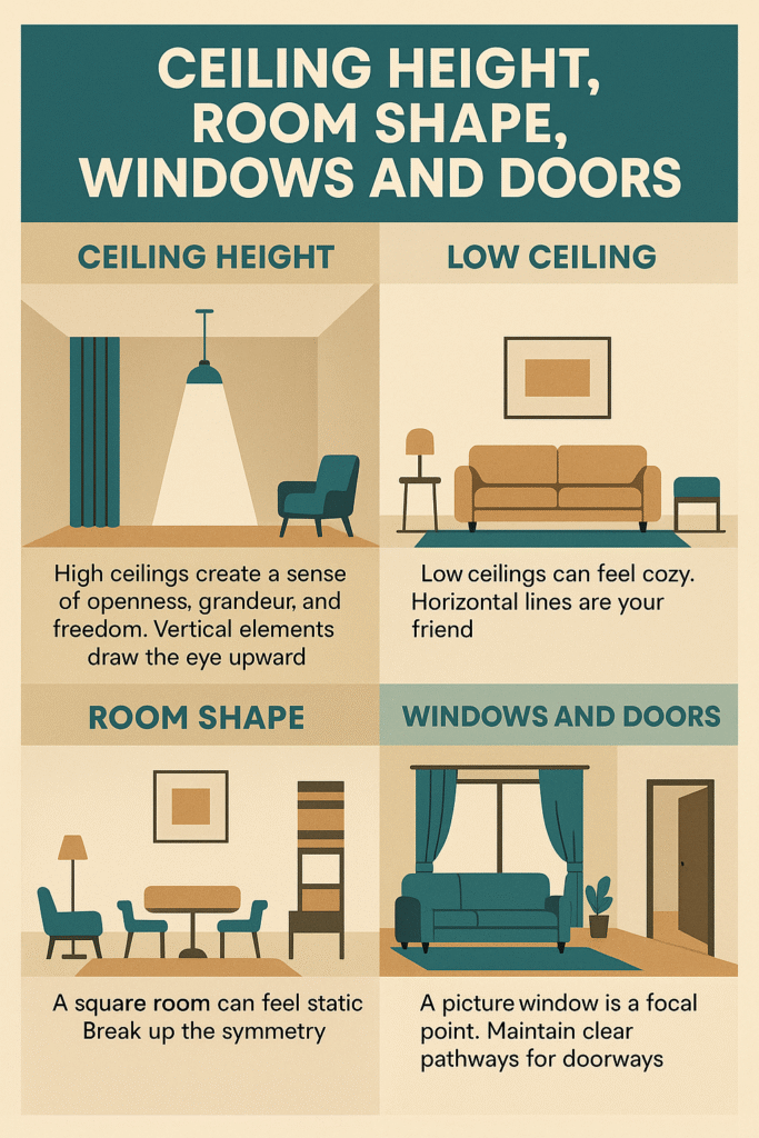
Before a single piece of furniture enters a room, its proportions are already defined by its architecture: the ceiling height, the placement of windows and doors, and the overall length and width. These fixed elements are the canvas upon which you build your design, and they profoundly influence how we perceive the space.
- Ceiling Height: High ceilings create a sense of openness, grandeur, and freedom. They call for vertical elements to draw the eye upward, such as tall curtains, towering bookshelves, or pendant lights with long cords. Low ceilings, common in cozier spaces, require a different approach. Here, horizontal lines are your friend.Low-profile furniture, horizontal stripes, and avoiding tall, bulky pieces can make the ceiling feel higher than it is.
- Room Shape: A perfectly square room can feel static and uninteresting. The key is to break up the symmetry, perhaps by creating an asymmetrical furniture grouping or a strong focal point on one wall. Long, narrow rooms (often called “bowling alleys”) present the opposite challenge. The goal is to visually widen the space by arranging furniture in distinct zones and using rugs to anchor these areas, breaking up the long, linear path.
- Windows and Doors: The size and placement of windows and doors are critical. A large picture window is a natural focal point and should be treated as such. Furniture should be arranged to complement it, not obstruct it. The flow of traffic through doorways must also be considered, ensuring clear pathways are maintained.
The challenge of creating functional and aesthetically pleasing floorplans is so complex that it’s a major focus of architectural AI research. The paper “Generating floorplans for various building functionalities” describes a model that learns from building footprints to generate harmonious layouts.It highlights that architects must find optimal solutions that satisfy functional requirements while possessing “aesthetic appeal.” This confirms that the inherent proportions of a building’s architecture are the foundational layer of a harmonious interior.
I believe this is why some rooms feel “off” no matter how you decorate them. If the underlying architectural proportions are challenging, you have to work much harder with your interior design choices to counteract those issues and create a sense of spatial harmony.

Designing for Humans: The Critical Role of Ergonomics and Scale
Beyond the visual harmony of a room, proportions play a vital role in its functionality and comfort. This is where ergonomics—the science of designing for human use—comes in. Ergonomics is all about proportions on a human scale. If the relationship between the furniture and the human body is wrong, the space will be uncomfortable and impractical, no matter how beautiful it looks.
Key ergonomic proportions to consider:
- Circulation and Pathways: You need to leave enough space for people to move around comfortably. Main traffic paths should be at least 36 inches wide. The space between a coffee table and a sofa should be around 18 inches—close enough to reach, but far enough to allow legroom.
- Seating Dimensions: The standard height for a dining chair seat is around 18 inches, which is proportional to the standard 30-inch height of a dining table. The depth of a sofa should allow an average person to sit with their back against the cushions and their feet on the floor.
- Task-Based Proportions: The height of a kitchen counter (typically 36 inches) is designed for the average person to work at while standing. The distance between the “kitchen work triangle”—the sink, refrigerator, and stove—is optimized for efficiency.
Did you know that the “kitchen work triangle,” a core principle of kitchen design, was developed in the 1940s at the University of Illinois School of Architecture to improve efficiency for the modern homeowner?
This is where design truly becomes a science of human experience. I think it’s easy to get caught up in aesthetics and forget that a room has a job to do. A beautiful chair you can’t sit in comfortably for more than ten minutes is ultimately a design failure. This fusion of beauty and utility is the essence of great design.
AI design tools are being explicitly programmed with these ergonomic rules. Research on systems like Personalized Interiors at Scale emphasizes extracting “intra-object and inter-object constraints” to guide object placement.These constraints include accessibility requirements, such as ensuring walkways are clear. This demonstrates that for a space to be truly harmonious, its proportions must be tailored not just to the room, but to the people who will live in it.
The Art of the Void: Using Negative Space to Create Balance and Flow
In design, the space you don’t fill is just as important as the space you do. This empty space is known as negative space, and it’s a crucial element for creating proportional balance. A room filled to the brim with furniture, art, and accessories, with no room to breathe, feels cluttered, overwhelming, and chaotic. Negative space provides visual relief, allows the eye to rest, and helps to define and highlight the objects you do want to be the focus.
Here’s how negative space contributes to harmony:
- Creating Balance: It provides a counterbalance to the “positive space” (the objects themselves). A large, heavy piece of furniture can be balanced by a significant area of empty wall space next to it.
- Improving Flow: Proper use of negative space is essential for creating clear circulation paths, as we discussed in ergonomics. It ensures a room is easy to navigate and feels open and airy.
- Directing Focus: By surrounding a focal point—like a fireplace, a piece of art, or a beautiful view—with negative space, you naturally draw the eye towards it and increase its impact.
- Conveying Luxury: In many cases, an abundance of negative space is a hallmark of luxury design. It implies that you have space to spare and don’t need to fill every square inch, creating a feeling of calm and sophistication.
I’ve found that learning to appreciate and strategically use negative space is one of the biggest leaps a designer can make. It’s a shift from thinking “What can I add?” to “What does this space need?” Sometimes, what it needs is nothing at all. This principle is so fundamental that even procedural generators have “accessibility cost” and “freespace” constraints in their solvers to ensure objects don’t block pathways and that there’s enough open area for the scene to feel realistic.

A Practical Guide to Proportional Placement and Grouping
Understanding the theory of proportion is one thing; applying it is another. One of the most effective ways to create harmony is through the thoughtful grouping of objects. A collection of small, scattered items can look like clutter, but when grouped together, they become a single, cohesive statement.
Here are some practical rules for proportional grouping:
- The Rule of Threes (or Odds): Grouping items in odd numbers—typically three or five—is more visually appealing and dynamic than grouping in even numbers. Our brains find even numbers to be symmetrical and static, while odd numbers create a sense of movement and interest. This works for everything from throw pillows on a sofa to vases on a console table.
- Vary Height, Shape, and Texture: When creating a vignette (a small, curated grouping of objects), choose items with different heights and shapes to create a dynamic skyline. For example, on a mantelpiece, you might group a tall vase, a medium-sized framed photo, and a low, wide bowl. Mixing textures also adds depth and interest.
- Use a Common Thread: To make a grouping feel cohesive rather than random, unite the items with a common element. This could be a shared color palette, material (e.g., all metallic objects), or theme (e.g., coastal-inspired decor).
- The Triangle Principle: Arrange objects within a group to form a rough triangular shape. This is a classic composition technique that guides the eye through the arrangement and creates a sense of stability and balance in design.
Computational approaches are mirroring these human-centric techniques. The paper on RelTriple discusses how its model uses clustering algorithms to delineate object groups.This is a highly technical way of saying the AI is learning the same thing designers do intuitively: that objects are best understood and arranged not as individuals, but as members of a harmonious group.
When to Bend the Rules: Creating Dynamic Tension in Your Design
Once you understand the rules of proportion, you can learn when and how to break them effectively. While adherence to interior design principles like the Golden Ratio and the Rule of Thirds creates harmony and balance, sometimes a design needs a jolt of energy or an unexpected surprise. Intentionally breaking the rules of proportion is a powerful way to create a focal point and add personality to a space.
Here’s how to bend the rules with purpose:
- Play with Scale: Introducing a single, dramatically oversized element can be incredibly effective. Think of a massive floor lamp arching over a sofa, or a huge piece of art that takes up an entire wall in a small powder room. This creates a “wow” moment and instantly makes the space memorable.
- Embrace Asymmetry: While symmetry is calming, perfect symmetry can sometimes be boring. Asymmetrical balance is often more sophisticated and dynamic. Instead of two identical lamps on either side of a bed, try one lamp on a nightstand and a pendant light on the other side. The visual weight is balanced, but the arrangement is far more interesting.
- Unexpected Juxtaposition: Place an ornate, antique mirror over a sleek, modern console table. The contrast in style and proportion creates a dynamic tension that is visually exciting.
This is where human creativity currently outshines artificial intelligence. While AI systems are becoming incredibly adept at learning and applying rules to create functionally and aesthetically “correct” spaces, they struggle with the intentional, artful breaking of those rules. The ability to know when a touch of the “wrong” proportion will make a room feel perfectly “right” remains the domain of the human designer. It’s the art that complements the science.
Training Your Eye: How to Spot and Correct Proportional Imbalances
Developing a sense of proportion is like training a muscle. The more you use it, the stronger and more intuitive it becomes. Over time, you’ll be able to walk into any room and instantly sense what’s working and what isn’t. Here are a few exercises to help you train your eye:
- The Squint Test: This is a classic artist’s trick. Squint your eyes when looking at a room.This blurs the details and allows you to see the composition in terms of shapes, masses, and visual weight. You’ll immediately notice if one side of the room feels heavier than the other or if a piece is disproportionately large.
- Use Your Phone’s Camera: Take photos of rooms you like and dislike. The camera flattens the space into a 2D composition, making it easier to analyze. Use a photo editing app to overlay a 3×3 grid to check for the Rule of Thirds. Draw boxes around furniture to see their proportional relationships more clearly.
- Analyze, Don’t Just Look: When you’re in a space you admire (a hotel lobby, a friend’s well-designed home, a picture in a magazine), actively analyze why it works. What is the relationship between the sofa and the rug? How is the art grouped on the wall?How is negative space being used?
- Practice with Your Own Space: Start small. Clear a bookshelf or coffee table and rebuild the arrangement, paying close attention to the principles of grouping, varying heights, and using odd numbers. Take pictures and critique your own work.
By consciously practicing these techniques, you’ll move from passively observing spaces to actively understanding them. You’ll begin to see the hidden science of proportion everywhere, and you’ll be empowered to apply it to create your own harmonious, beautiful, and functional spaces.
*
Conclusion: The Perfect Blend of Art and Science
The journey through the science of proportion reveals a beautiful truth: the spaces that feel most inviting and serene are often governed by a hidden mathematical order. From the ancient Golden Ratio found in nature to the complex algorithms driving the future of design, the principles of proportion, scale, and balance are the bedrock of a well-designed interior. They are the tools we use to transform a mere collection of objects into a cohesive, harmonious environment.
But as we’ve seen, it’s not just about rigid rules. The true magic happens at the intersection of science and art—knowing the principles so well that you know precisely how and when to bend them. I believe that understanding this science doesn’t diminish the artistry; it enhances it. It empowers you to make more intentional choices, to solve design problems more effectively, and to create spaces that are not only visually pleasing but also deeply functional and comfortable for the people who inhabit them.
So the next time you walk into a room that just feels right, take a moment. Look closer.You might just be able to see the hidden science at work, conducting a silent symphony of spatial harmony.